CSS Grids


CSS Grid Layout (aka “Grid” or “CSS Grid”), is a two-dimensional grid-based layout system that, compared to any web layout system of the past, completely changes the way we design user interfaces.
Grid container
The HTML element which has display: grid applied, and therefore creates a new grid formatting context for the direct children.
.container {
  display: grid;
}
Grid item
A grid item is an item which is a direct child of the grid container.
<div class="container">
  <div class="item"></div>
  <div class="item"></div>
  <div class="item"></div>
</div>
Display Property An HTML element becomes a grid container when its display property is set to grid or inline-grid.
.grid-container {
  display: grid;
}
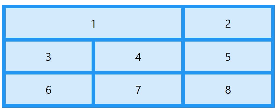
Grid Columns The vertical lines of grid items are called columns. Grid Rows The horizontal lines of grid items are called rows. Grid Gaps The spaces between each column/row are called gaps. You can adjust these gaps by specifying gap, row-gap and column-gap.
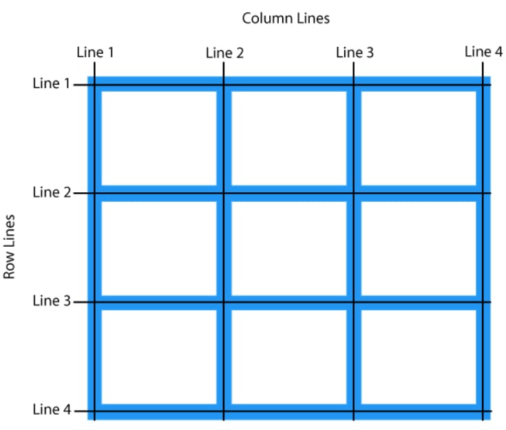
Grid Lines
The lines between columns are called column lines.
The lines between rows are called row lines.
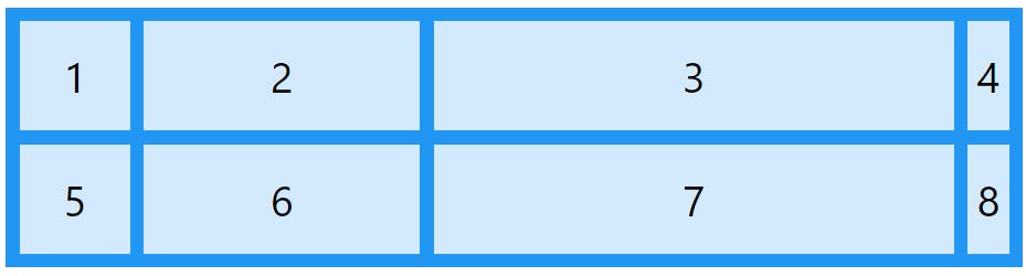
Example
Let us place a grid item at column line 1, and let it end on column line 3:
.item1 {
  grid-column-start: 1;
  grid-column-end: 3;
}
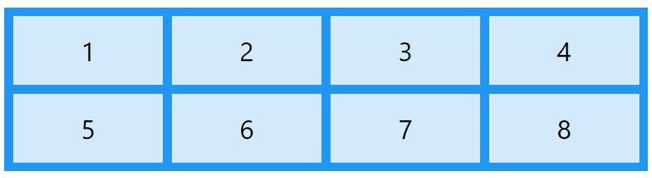
The grid-template-columns Property
The grid-template-columns property defines the number of columns in your grid layout, and it can define the width of each column.
The value is a space-separated-list, where each value defines the width of the respective column.
If you want your grid layout to contain 4 columns, specify the width of the 4 columns, or "auto" if all columns should have the same width.
Example
Make a grid with 4 columns:
.grid-container {
  display: grid;
  grid-template-columns: auto auto auto auto;
}
The grid-template-columns property can also be used to specify the size (width) of the columns.
Example
Set a size for the 4 columns:
.grid-container {
  display: grid;
  grid-template-columns: 80px 200px auto 40px;
}
The grid-template-rows Property
The grid-template-rows property defines the height of each row. The properties of this is similar to the grid-template-column
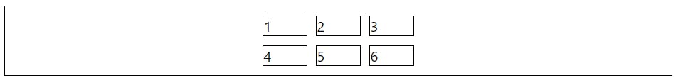
Justify-content
The justify-content property is used to align the whole grid inside the container.
Example
.container {
    border: 1px solid black;
    padding: 10px;
    display: grid;
    grid-template-columns: 50px 50px 50px;
    justify-content: center;
    gap: 10px;
}
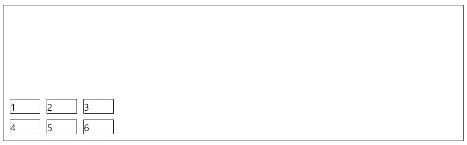
Align-content
The align-content property is used to vertically align the whole grid inside the container.
.container {
    border: 1px solid black;
    padding: 10px;
    display: grid;
    grid-template-columns: 50px 50px 50px;
    align-content: end;
    gap: 10px;
}
Thank you for reading. 🙏