Flexbox in CSS


PermalinkWhat is a Flexbox?
Flexbox is a one-dimensional layout method for arranging items in rows or columns. Items flex (expand) to fill additional space or shrink to fit into smaller spaces.
PermalinkThere are two aspects of a Flexbox: Flex container and Flex item
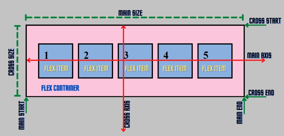
The flex items can be laid out either along the main axis (starting from the main start and ending at the main end) or along the cross axis (starting from the cross start and ending at the cross end).
- Main axis: Flex items are laid out along this axis, either horizontally or vertically based upon the flex-direction.
- Cross axis: It is perpendicular to the main axis and its direction depends on the direction of the main axis.
- Main size: It is the width/height of the flex item depending on the main dimension.
- Cross size: It is the width/height of the flex item depending on the cross dimension.
Let us now look at how a flexbox works
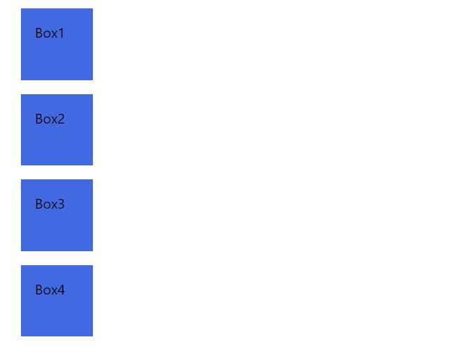
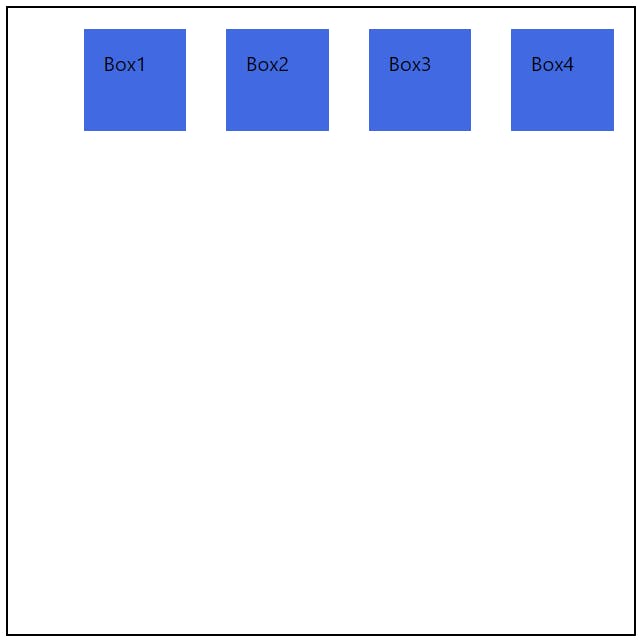
So, below is an illustration as to how a box is displayed without flex property.
HTML
<body>
    <div class="container">
        <div class="box box-1">Box1</div>
        <div class="box box-2">Box2</div>
        <div class="box box-3">Box3</div>
        <div class="box box-4">Box4</div>
    </div>
</body>
CSS
.box {
    width: 50px;
    height: 50px;
    background-color: royalblue;
    padding: 16px;
    margin: 16px;
}
The boxes will align vertically as shown below
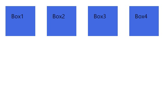
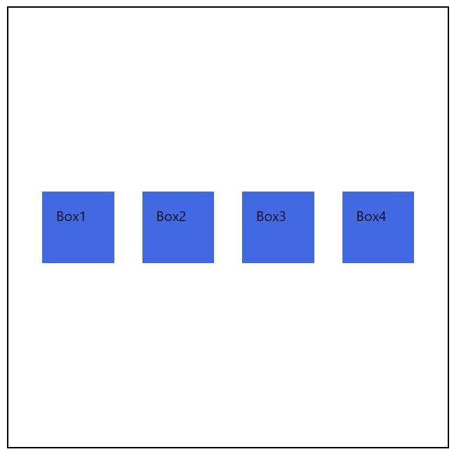
Now, let us give flex property to the boxes parent container.
CSS
.container {
    display: flex;
}

.box {
    width: 50px;
    height: 50px;
    background-color: royalblue;
    padding: 16px;
    margin: 16px;
}
This will align the boxes horizontally as shown below. We can also change its direction by using the flex direction property.
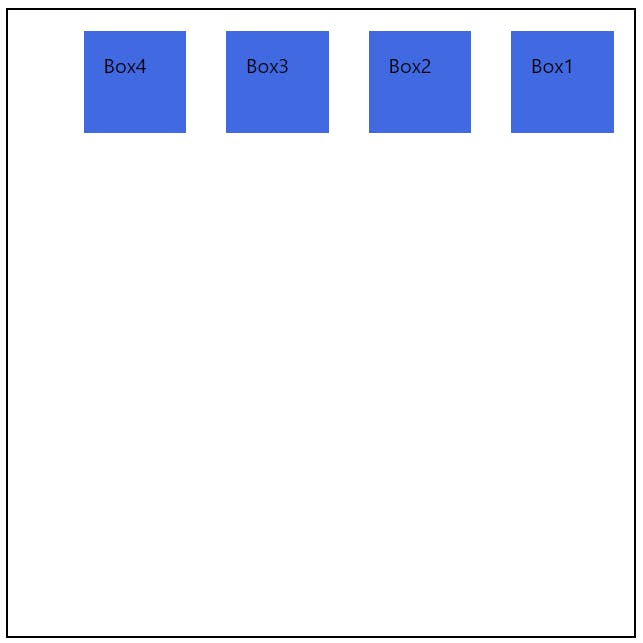
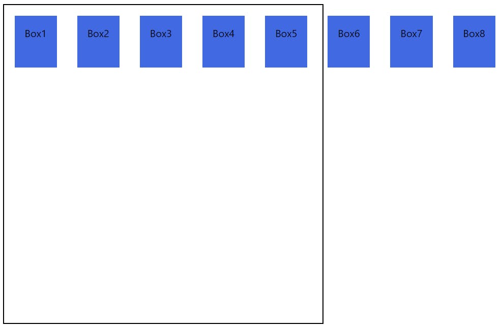
Flex-direction
The flex direction properties are row and column. We can also reverse the order of elements in that direction by giving row-reverse and column reverse.
.container {
    width: 500px;
    height: 500px;
    border: 2px solid black;
    display: flex;
    flex-direction: row-reverse;
}
Justify content
This is a flexbox property used to justify the elements inside the flexbox in the direction of the main axis. There are many options to align such as start, end, center, space-around, space-between.
.container {
    width: 500px;
    height: 500px;
    border: 2px solid black;
    display: flex;
    justify-content: end;
}
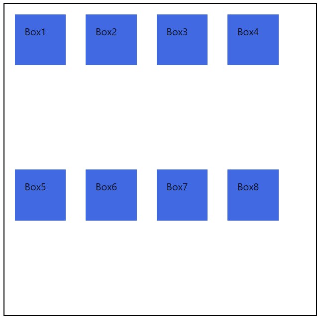
Align-items
This is a flexbox property used to align the elements inside the flexbox in the direction of the cross axis. There are many options to align such as start, end, center, space-around, space-between.
.container {
    width: 500px;
    height: 500px;
    border: 2px solid black;
    display: flex;
    justify-content: center;
    align-items: center;
}
Flex wrap
The flex-wrap CSS property sets whether flex items are forced onto one line or can wrap onto multiple lines. If wrapping is allowed, it sets the direction that lines are stacked.
we can either specify no flex-wrap at all or set it to no wrap in css
.container {
    width: 500px;
    height: 500px;
    border: 2px solid black;
    display: flex;
    flex-wrap: nowrap;
}
It will look like this
To wrap it, we need to specify the flex-wrap
.container {
    width: 500px;
    height: 500px;
    border: 2px solid black;
    display: flex;
    flex-wrap: wrap;
}
These are some of the most important and basic concepts needed to get you started with Flexbox.
Here is a fun and unique way to practice Flexbox by playing a game. Check this out. Flexbox froggy
That's it for this article. Hope you liked it and thank you for reading🙏